
Mistake 1:
Focusing on Competitors Within Your Industry Only
Look outside your vertical first. Unless you’re in a cutting-edge design industry/vertical such as consumer travel or food delivery, chances are the best-in-class online experiences are happening outside your vertical.
It used to be that customers compared your offering to that of your competitors, especially in the B2B world. Now, they compare you to Amazon, Airbnb, Spotify, or the like—the “places” where they spend 80% of their time. By looking outside the vertical, you also understand how your customers are viewing you in context of other choices in their lives.
For example, compact camera makers were caught flatfooted by smartphone adoption and innovation. Your customers are always looking at the broader landscape when making decisions. Are you?
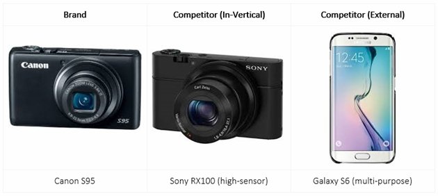
Solution: Conduct a mini competitive analysis that consists of at least five companies outside your vertical. Select ones you consider are doing well on consumer-facing elements (design, marketing, and engagement).
Mistake 2:
Starting with Design, Not the Desired Outcomes
The ideal scenario: “Let’s understand what our customers need to achieve by using our product/service before we create this product page.”
The reality: “I need to get this page up on the site today/tomorrow/this weekend.”
Marketers will typically start with an existing page, similar product page, or a competitor’s page and design their new product in.The cookie-cutter approach works well if you’re adding in a similar item, but it doesn’t when there’s a significant difference in the following:
- Customer type
- Customer behavior (motivation)
- Customer journey
Solution: Before starting design, create customer profiles to…
- Understand your customers’ motivations
- Map their consideration and purchase journey
- Choose the appropriate design templates
- Write more focused content that addresses their fears and desires
Mistake 3:
Focusing on Broad Target Audience, Not Well-Defined Customer Profiles
“All consumers are our audience.”
“Our target audience is young adults, soccer moms, and casual athletes.”
I often encounter marketers who are trying to reach multiple target audiences with one message. Reach, yes; engage, questionable…
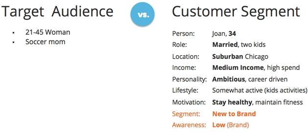
A customer profile is critical for three key reasons:
- You can visualize your customer better (important for empathy)
- It is more directional for copy, imagery, tone of voice, and calls to action
- It helps prioritize messaging—what benefits or features to prioritize
In short, design with your most important customer in mind.
The evidence: Roller bags are a mass-market product that were originally designed for a specific customer segment: Flight attendants. They had to walk (occasionally run) down long hallways while having packed enough for a few days. Carrying and running with bags was a back-breaker—literally.
The key features of roller bags were super-focused on serving their needs:
- Compact—fit inside the plane
- Collapsible long handle—easy to drag, then stow away
- Sturdy wheels that don’t get stuck—work on tarmac (small airports) and polished floors
Today, it’s hard to find a travel suitcase that doesn’t come with wheels. That’s the benefit of designing with your most important customer in mind.
Solution:
- Spend just 20 minutes each with 5-7 people within your core customer segment.
- Create basic customer personas—the simpler, the more actionable.
- Include demographic, brand-specific, and behavioral (specific to vertical/market) attributes.
- Sketch 1-2 customer journeys per profile to visualize how this audience would “travel” through marketing stages and channels.
Mistake 4:
Designer-Centered Design, AKA Design by Community
This is something a group of people do, without being aware they’re doing it. In meetings, people design an experience while claiming to know the users well and speaking on the users’ behalf. In reality, however, uniform opinions, biases, personal motivations, and business goals quickly become the basis for design, and user needs are only half-heartedly accommodated.
When you start talking about the “user” or “the customer,” you have become a designer.
Design by community is usually the kiss of death for great customer experience.
Enlightened marketers and good UX designers know that well and try to minimize bias. Sadly, it is hard to argue this point in a meeting, where loud ar executive voices dominate.
Solution:
- Good: Have a checklist of customer needs and pain-points your brand has to deliver on to achieve business results.
- Better: Have a persuasive user experience practitioner who knows how to balance business and customer needs and—more important—knows how to persuade and convince people who have different motivations and goals.
- Best: Conduct qualitative (one-on-one) customer research, then share the findings with customer quotes (and video, if possible) to persuade at an emotional level.
Mistake 5:
Asking for Too Many Outcomes
Most marketers are guilty of this one: a long list of things to interact with and read, buttons to click and forms to fill. And when implemented, it never results in a happy ending. Various possible user actions on a product page:
- Click on multiple tabs
- View image gallery
- Watch a video
- Read reviews
- Read FAQs
- Check pricing
- Add to cart
- Add to wish-list
- Ask a question
- Sign up for a newsletter
- See related products/services
The reality is that peoples’ attention spans are more fragmented than ever. Moreover, attention spans get shorter as the day goes on—to the point that we’re happy to just sit back, scroll, and not really interact with sliders, accordions, etc. on a Web page. When faced with multiple clickable options on a product page, most users will click once or twice to explore something and skip (or scroll through) the rest.
Your first-time visitors are likely to take ONE action, if they take any at all. This is something I have observed in countless usability sessions. They’ll skim through some other stuff and ignore the remaining. So think carefully about the top two or three actions you want a visitor to take, then design the experience around those.
Solution:
- Limit consumer desired actions to 2-3, no more than 5.
- Prioritize those actions based on customer need first, then business goals.
- Convey their importance to the user by creating an appropriate visual hierarchy.
Mistake 6:
Ignoring WIIFM—Not Offering Anything of Value in Return
A corollary of Mistake 5 is not delivering enough or any value in return for a desirable user action. Often, people will click on a link but in return get an underwhelming result—and so no WIIFM (what’s in it for me). Here are two examples:
- A product page that doesn’t offer much more information than the quick-view overlay
- A gated content landing page that provides few details while asking for a lot of customer info
The result is lowered trust and low expectations. Worse, if your gated content (e.g., webinar/whitepaper) does not deliver enough value, your visitor is less likely to click on something far more important. That “once bitten, twice shy” rule is widely prevalent online.
Solution:
- Review your CTAs that lead to high-value (or gated) content.
- Set expectations where possible (e.g., gated-content landing page).
- Deliver a lot of value at the destination page/screen.
If you are not sure what your customers see as high-value, it is time to do some customer research.
Mistake 7:
Launching Without User Testing
Common mistakes such as designer-centered design, usability, and messaging can be easily corrected by qualitative user testing. I encounter a lot of hesitation, especially in doing qualitative research. I’ve done an entire webinar on the topic. (In this customer research webinar, I outline how to overcome barriers to including voice of customer in your workflow. (Free registration required.))
What I find often is that marketers will do A/B testing—after the site/app has been built and launched. A/B testing works if you fully understand who your customer is and the why behind their behaviors and actions. Otherwise, you run the risk of being precise but inaccurate.
Solution:
- Do lean usability testing—at an early stage in the design process.
- Use mockups (preferably black-and-white wireframes)
- Start by interviewing 5-7 people within your core customer segment (30-minute sessions).
Thank you to the folks at MarketingProfs for this informative article. Read more here.